Paramedic, App for ambulance crews
Informed. Prepared. Guided.
Project Details
- Category
- Service design
- Discipline
- Service design, UI design, UX design
- Team
- Group project with Žiga Dolinar and Gal Grobovšek
Paramedic is an app for ambulance crews. It gathers everything known about a patient in one place and guides the team through every stage of an intervention, from the first alert to handing the patient over at the hospital.
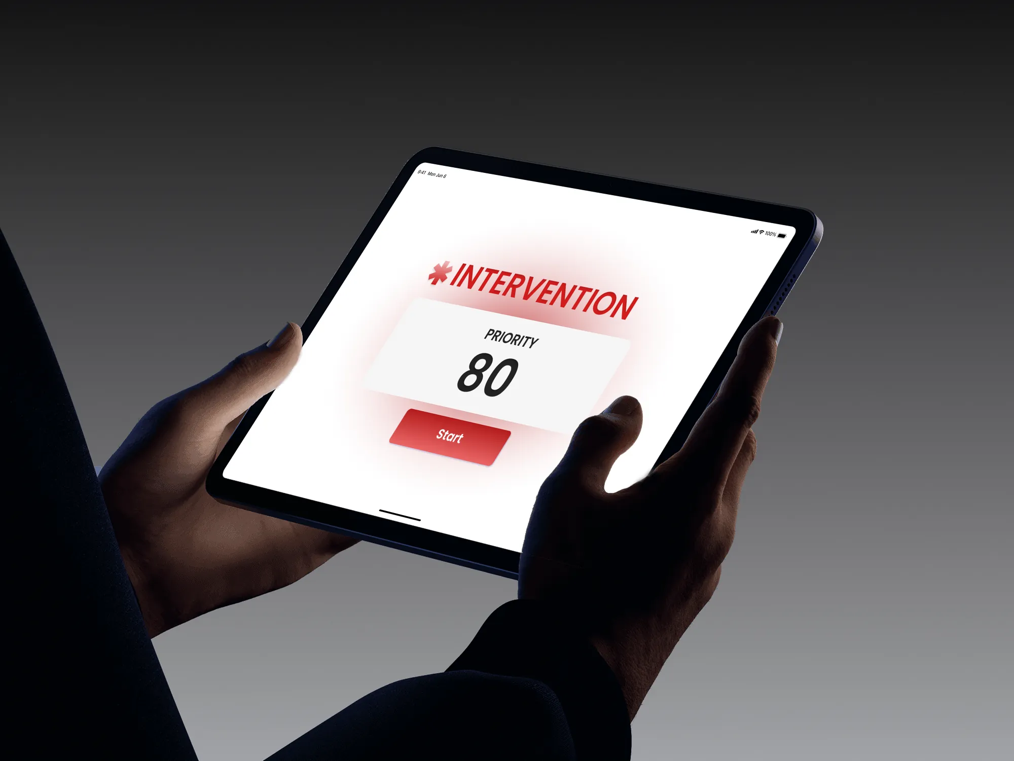
80
insights from interviews with doctors, general practitioners and hospital specialists
Around 5
healthcare information systems in Slovenia that don’t talk to each other
0–5
radio statuses paramedics already work in. The app follows the same steps.
Research
Around five systems that don’t talk to each other.
How medical staff access and handle patient information in Slovenia was the starting brief. After desk research, the team interviewed doctors, general practitioners and hospital specialists, and wrote 80 insights.
One theme kept coming up. Slovenia runs around five healthcare information systems that don’t talk to each other. A GP told them: “Many times we have to take blood because we can’t see the results, and the patient had blood taken 14 days ago.”
Focus
Where does missing information hurt most?
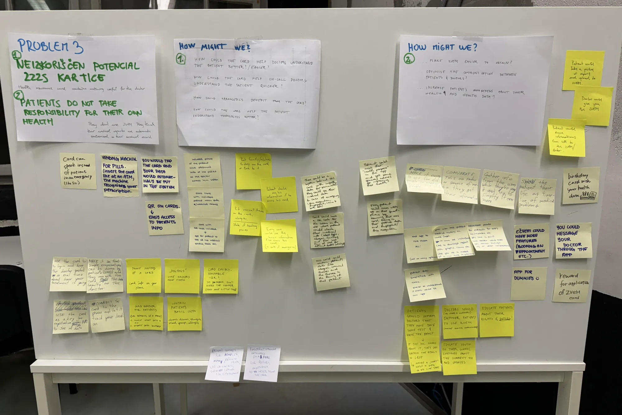
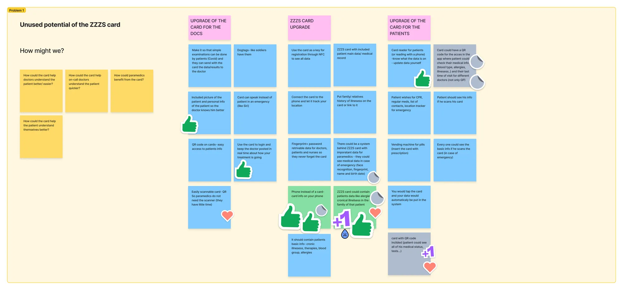
The team brainstormed around the untapped potential of the national health insurance card, and patients taking more responsibility for their own health data. When they evaluated the directions, a third one stood out. Doctors can at least ask the patient or wait for records. Paramedics often can’t. They arrive knowing nothing about the person in front of them, so the team changed its focus.
In additional in-depth interviews, paramedics explained that dispatchers collect information from callers who are often in shock, so it isn’t always reliable. What paramedics need most is short and specific. Age, for example, is critical with children.
What paramedics need most
Allergies, age, weight, chronic illnesses and therapies, past treatments, last meal, last memory before the incident
Mapping
From the 112 call to the handover.
With the paramedics’ input, the team mapped a full intervention in a large flowchart. It runs from the 112 call through dispatch, the drive, the assessment on scene, transport and handover. They revised it after the second round of interviews.
The map showed them the backbone of the app: paramedics already work in radio statuses from 0 to 5, so the app follows the same steps.
The app
One app, six statuses.
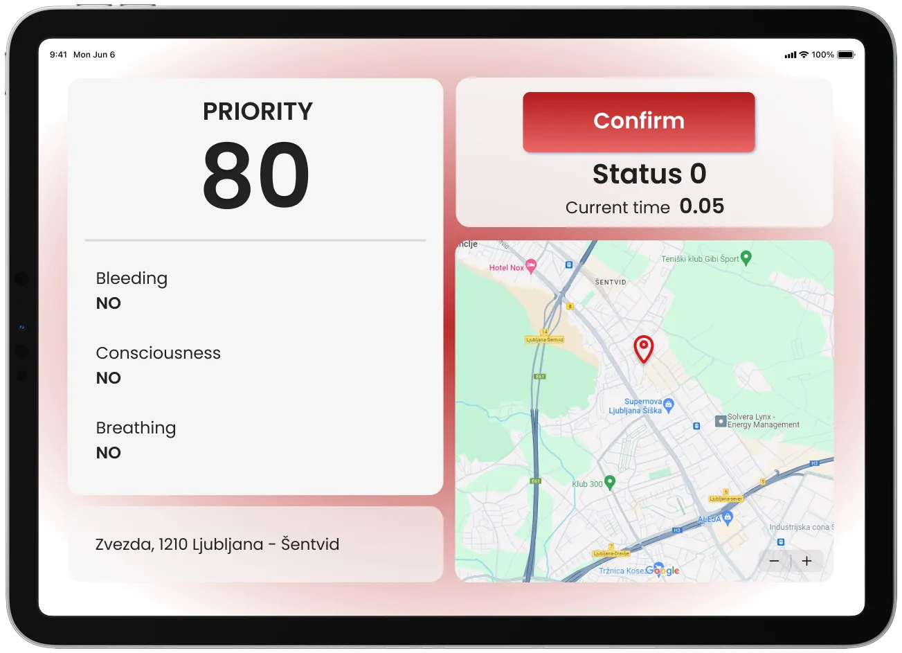
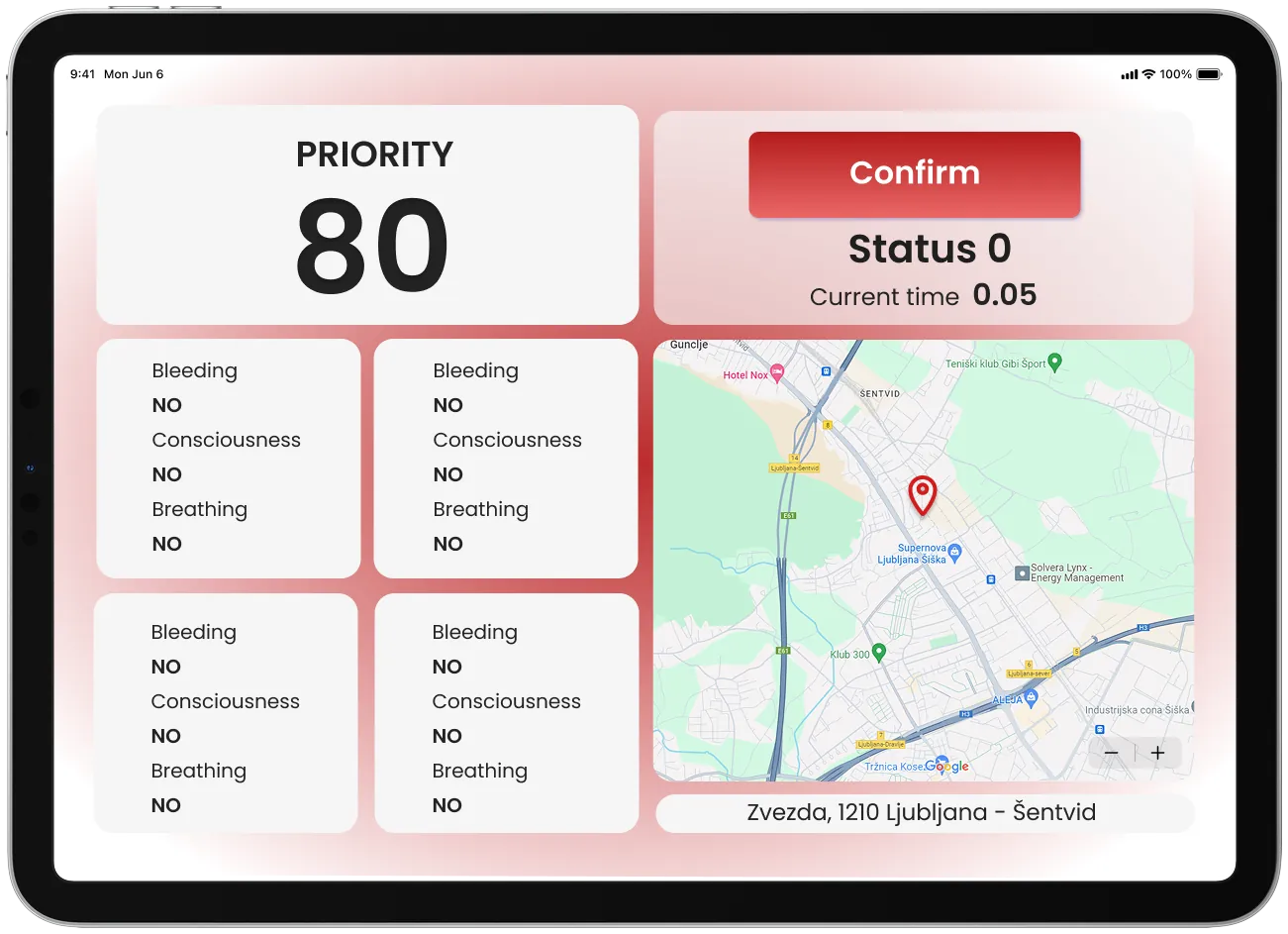
- 0AlertPriority, location on a map, and the patient’s basic condition (bleeding, consciousness, breathing). A mass-casualty mode shows several patients at once.
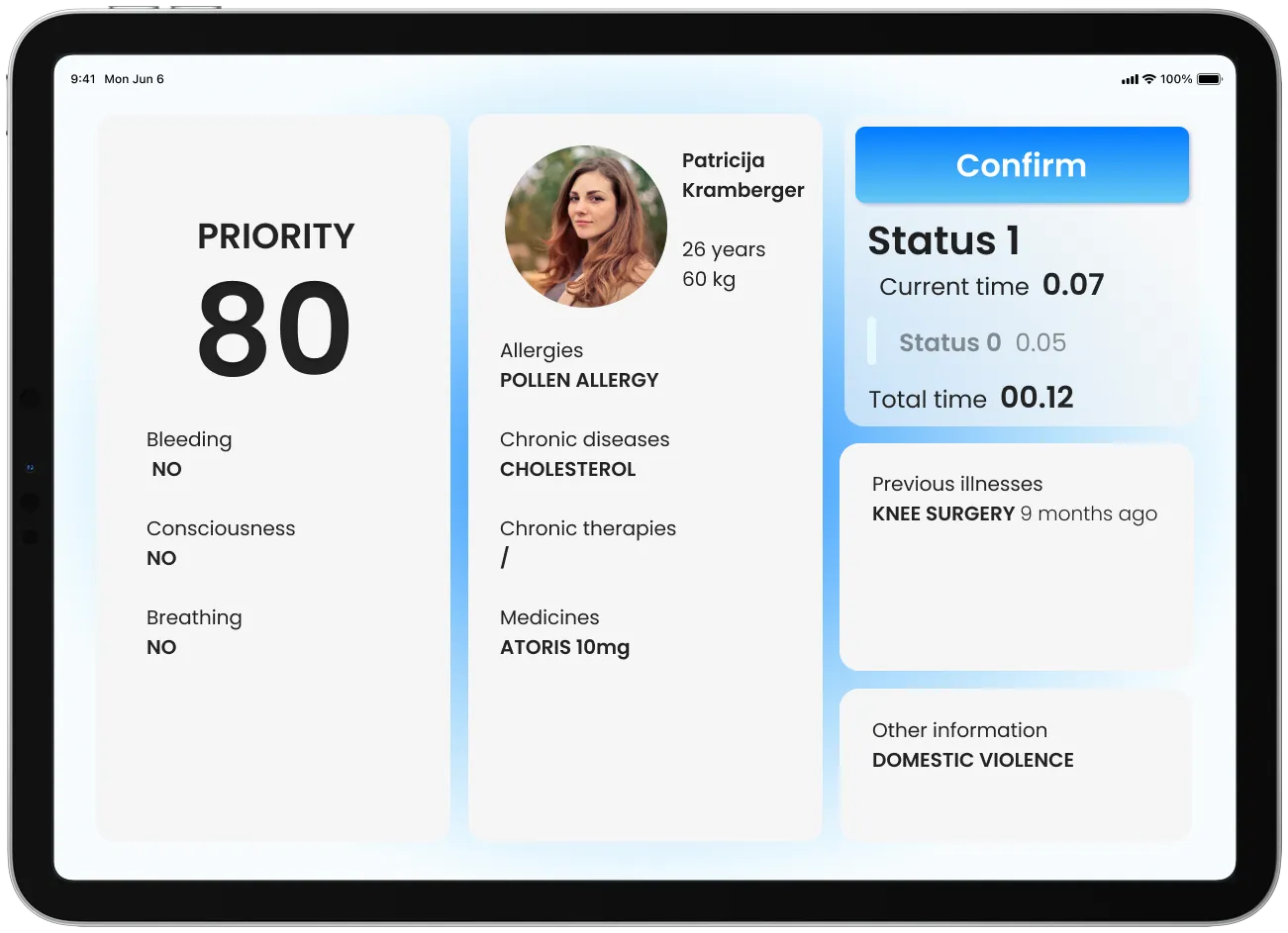
- 1On the wayThe patient’s profile, with allergies, chronic diseases, medicines, previous illnesses and other critical notes. Patients, doctors and dispatchers can enter data, so the crew sees it all in one place.
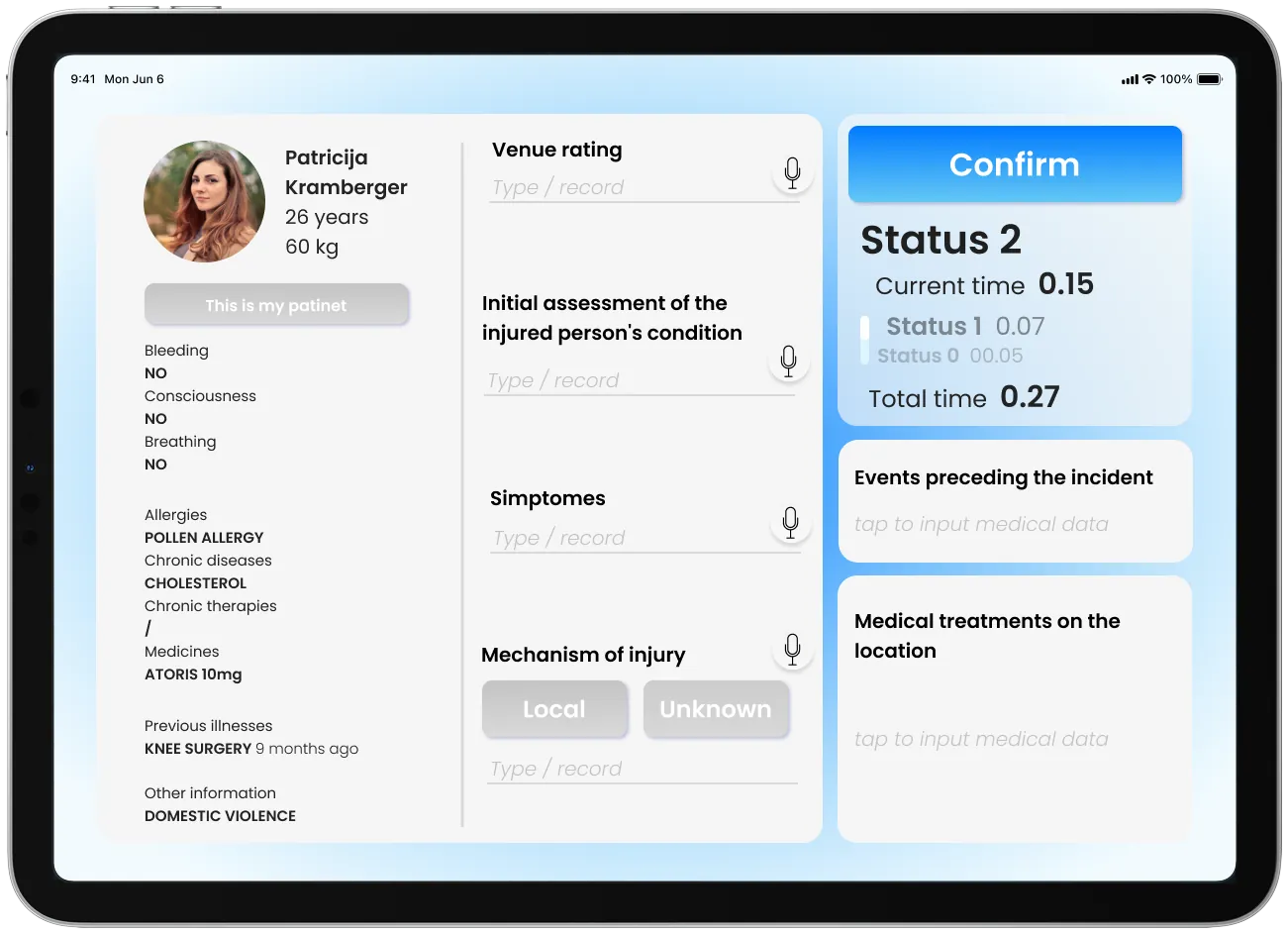
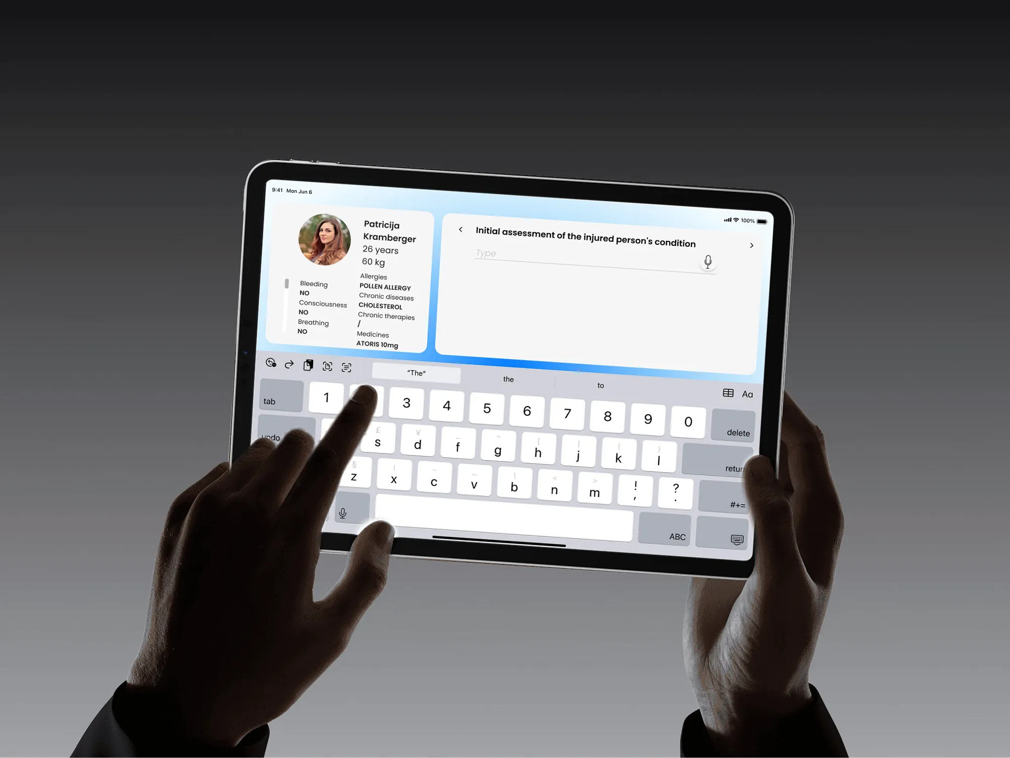
- 2On sceneGuided assessment using the ITLS and SAMPLE protocols the paramedics already use. Every field can be filled in by voice, so hands stay free.
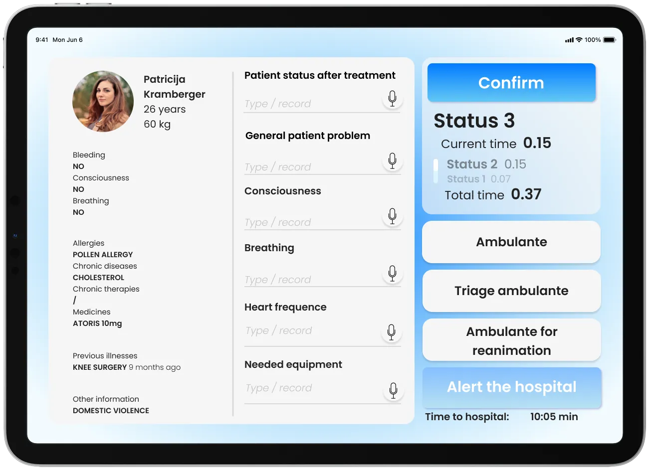
- 3Load and goThe crew adds the patient’s condition and decides which unit to take them to.
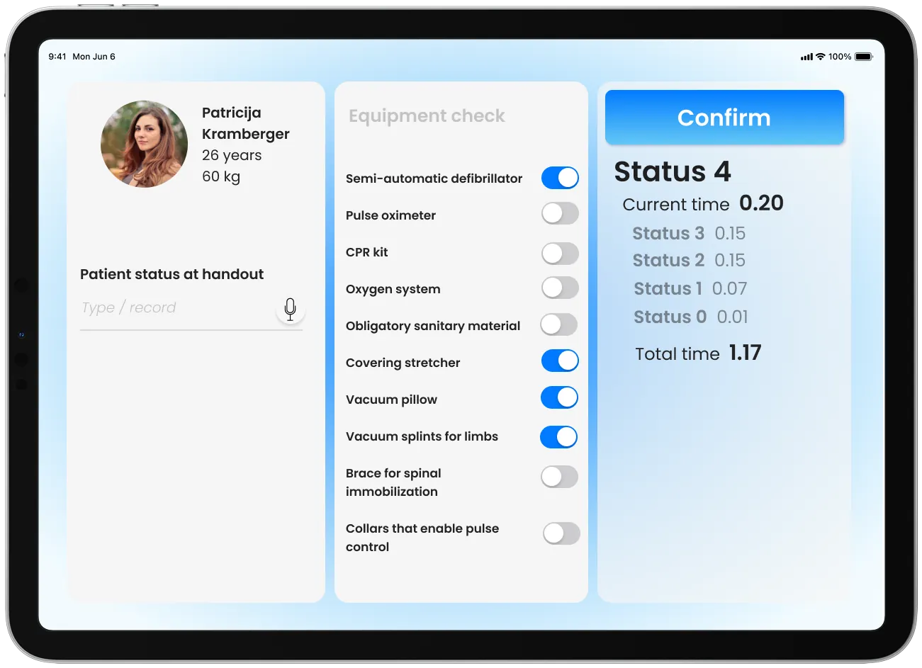
- 4HandoverA recorded summary of the patient’s condition for the hospital team, plus an equipment checklist to restock the ambulance.
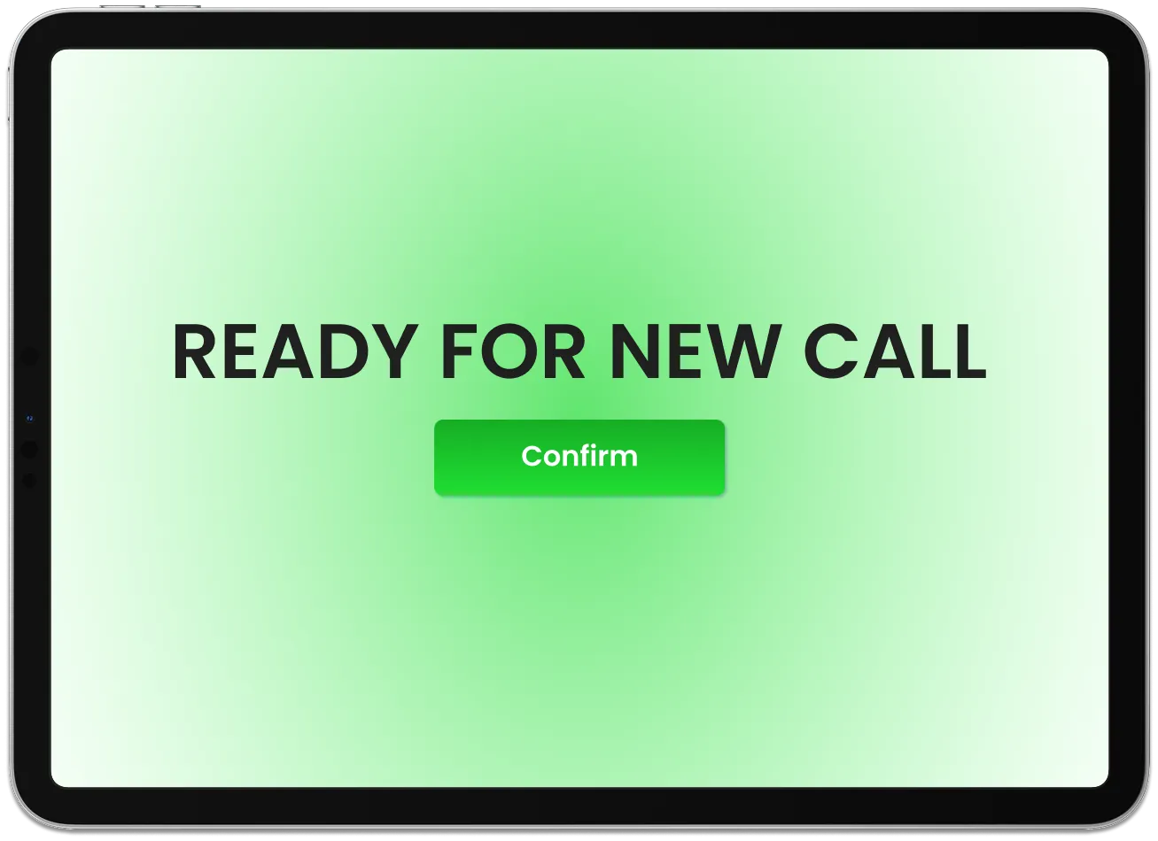
- 5ReadyOne tap confirms the crew is ready for the next call.